Santa Fe Bus Shelter Upgrades
Santa Fe Trails is a successful transit system serving the citizens of Santa Fe for over 18 years with 10 routes. Santa Fe Trails bus system provides affordable transit options for a wide spectrum of Santa Fe residents. While the current system has served the citizens of Santa Fe well, it was in need of improvement. There was great disparity in types and quality of bus stops and a lack of an overall identity for the transit system.
Project Goals
A new and coherent Brand image for Santa Fe Trails.
Increased ridership through improved rider comfort and ease of use, resulting in a lower carbon footprint for the City Different.
Integrate public art into the transit system.
Design Concept
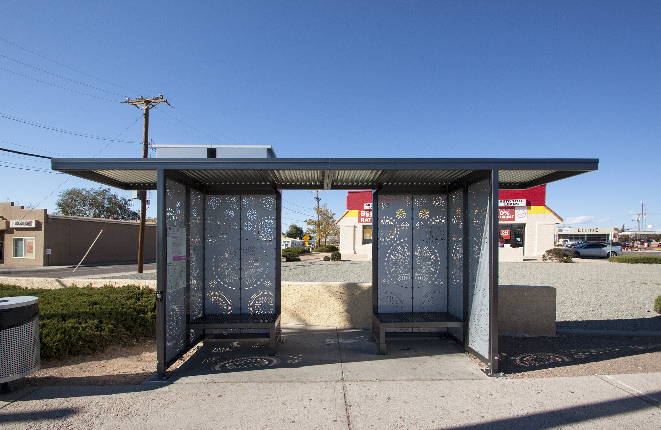
The inspiration for the Bus Shelter Upgrades is the traditional punched tinwork of Northern New Mexico. The opening of the Santa Fe Trail in 1821 brought an influx of tin canned goods from the East which resourceful local artisans recycled into exquisite pieces of religious and household art. This project utilizes punched tin style metal art panels in the shelters, connecting this modern transit system to the rich artistic tradition of Santa Fe.
Design Approach
The project utilizes a series of components that can be combined to create a series of “product packages” – bus shelters and street furniture of various sizes & configurations. These product packages provide Santa Fe Trails with a flexible system for upgrading stops based upon ridership, available right of way width and other factors. The components are tube steel framed art panels, evocative of traditional punched tin artwork. These components shelter riders from the elements while also utilizing Santa Fe’s intense sunlight to create ever-changing patterns of light and shadow within the shelters.
Integrated Artwork
A multi-disciplinary design team including a tinsmith artist, branding and signage consultants worked closely with a City working group with members of the Transit Division, Arts Commission, Facilities Division, Historic Preservation Division and Disability Committee to develop the project. Together we established a vision for the project which included strategic upgrades to existing shelters, integration of public art into the system, a new logo and new signage. Circular design motifs, based upon Native American Basket weaving patterns, were chosen to reflect movement and progress.
Planning Principles
In order to maximize the project’s impact, a thorough system-wide study was conducted to prioritize which bus stops would be upgraded. In addition to replacing aged bus shelters, it was determined that shelter upgrades should occur at important community resource locations and at strategic locations within the system in order to better serve the public and enhance the visibility of the upgrades & rebranding effort.


